
Cards
Cards are bounded surfaces that each carry one item, a photo or an avatar, a title, a short row of stats and usually a single action, so a page of them can be scanned as a set of things rather than read top to bottom. The border and the shadow do real work: they say where one item ends and the next begins, which is what lets a grid hold entries that aren't the same shape.
The eight blocks in this family are a good argument against calling these product cards. One is a job post with an hourly rate, one is an identity record with a scannable code, one is a boarding pass with a countdown on the route. Same shell, unrelated content. The thing that trips people up is hover: lifting the whole card promises that the whole card is clickable, so either make it clickable or keep the lift on the button. A card that animates and then does nothing when you click the photo is worse than a flat one.
Job post
Best for
Freelance boards, hiring feeds: a listing with a rate and a Contact CTA
Anatomy
Avatar with a presence dot · a tag row · headline and description · rate + Hourly badge · a full-width Contact button · hover lifts the whole card

Ethan Cole
Posted 4 minutes ago
Looking for a creative UI/UX designer to build our app
Remote, four days a week, alongside two engineers who ship every Thursday. You would own the design system end to end.
$200/hr
HourlyRecipe
Best for
Cooking and food apps: a dish card with time, servings and difficulty
Anatomy
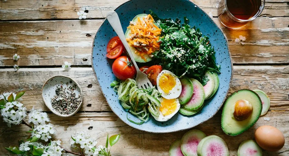
Photo with a badge · title and description · a three-cell stat row · ingredient tags · a Label / primary CTA pair
 Spicy choice
Soft eggs and avocado bowl
Six-minute eggs over courgette noodles, avocado and dressed greens, finished with sesame. Twenty minutes start to finish.
Apartment listing
Best for
Rental catalogues: a tall photo, an inline price, no footer to spare
Anatomy
400px photo with a text badge · title with an inline /m price · a truncated description · a Beds / Bathrooms / Sqft stat row
 Guest favorite
Loft in Kreuzberg
Top floor, 84 m², sunny balcony
$3,561/m
Apartment for sale
Best for
Real-estate listings: a price-led card with a byline and two CTAs
Anatomy
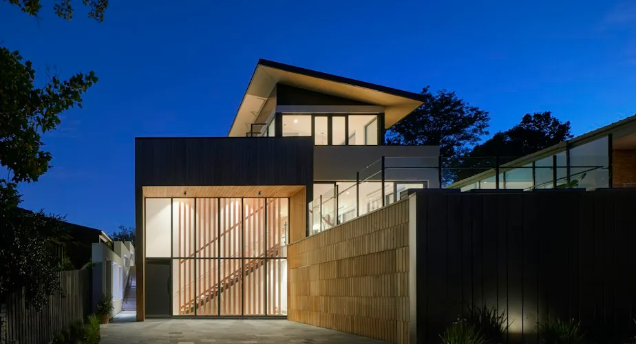
Photo with an icon badge · price above a city and street line · a stat row · a byline with a timestamp · a Save / View details pair
 Prime pick
Lyon·14 Rue des Tanneurs
Listed byMara Lindqvist
2 days agoVacation
Best for
Stay bookings: a full-bleed hero photo with a headline price
Anatomy
Full-bleed photo under a glass scrim · a glass badge · title, address and a headline price · a light stat row · a per-night price chip beside View details · hover adds a border
 Guest favorite
Villa Anaya, Canggu
Jl. Pantai Batu Bolong, Bali
Vacation, promoted
Best for
Featured stays: the same full-bleed shell, no headline price, a booking CTA
Anatomy
Full-bleed photo under a glass scrim · a solid iconed badge · title and a pin-led address row, no price · a light stat row · a per-night chip beside Reserve Now
 Prime pick
Birch Hollow Cabin
Blue Ridge Parkway, Asheville NC
Profile stats
Best for
Insurance and account profiles: an identity card with a 7-field stat grid
Anatomy
Avatar with status badges · an icon chip over an expiry line · a QR block · a 2-column stat grid, one field with a copy affordance · a full-width dark CTA
2 February 2027 (in 4 months)

Flight info
Best for
Boarding passes, travel apps: a route with a live countdown and boarding details
Anatomy
An Active / Inactive toggle pill · a From / To route row around a countdown badge and progress bar · a boarding-info box with three dividers · a full-width brand CTA
Using Cards
Reach for it when
- A grid of listings people compare before picking one to open
- Entries carrying a photo and a few unlike stats: price, rating, distance
- A record that has to stand alone on a phone: a pass, a profile, a ticket
- When the action belongs to the item rather than the page: Contact, Reserve, View details
Reach for something else when
- Rows of identical fields people want to sort and compare: use a table
- The full detail of one record: give it a page, not a card with a scrollbar inside it
- Section navigation: a list with leading icons carries it more quietly than a grid of boxes
Where it shows up
Rental listings
A search result needs a photo big enough to judge, the price where the eye lands first, and beds, baths and floor area in one row so two listings can be compared without opening either.
Job and gig boards
A post carries the poster's avatar, the skills as tags, the rate beside its unit, and a contact button that belongs to that post rather than to the page around it.
Boarding passes
Travel apps show a route, a countdown to boarding and the gate and seat details as one object a traveller holds on screen. The card boundary matters here: it is the document.
Account profile summaries
An identity or policy card gathers a photo, a status badge, an expiry date, a scannable code and a grid of fields that would read as a dull form anywhere else.
Questions
When should I use a card instead of a table row?
Use a card when the item has a picture and several unlike fields (a photo, a price, a rating, a tag row) and people judge one item at a time. Use a table when every item has the same handful of values and the reader's job is to sort, compare and scan a column rather than look at any single record.
Should the whole card be clickable, or only the button?
Pick one and make the visuals agree. If the card is the link, the hover state belongs to the card and any inner button has to stop the click reaching it. If only the button acts, do not lift or highlight the card on hover, because that lift is a promise. A card with two actions in its footer should not also be clickable as a whole.
Premium components,
free in your inbox.
Join the Orvain Dispatch and get production-ready components, free to keep: React and Vue code plus the Figma frame, yours to ship.


 Orvain MCP
Cards
Cards are bounded surfaces that each carry one item, a photo or an avatar, a title, a short row of stats and usually a single action, so a page of them can be scanned as a set of things rather than read top to bottom. The border and the shadow do real work: they say where one item ends and the next begins, which is what lets a grid hold entries that aren't the same shape.
The eight blocks in this family are a good argument against calling these product cards. One is a job post with an hourly rate, one is an identity record with a scannable code, one is a boarding pass with a countdown on the route. Same shell, unrelated content. The thing that trips people up is hover: lifting the whole card promises that the whole card is clickable, so either make it clickable or keep the lift on the button. A card that animates and then does nothing when you click the photo is worse than a flat one.
Job post
Best for
Freelance boards, hiring feeds: a listing with a rate and a Contact CTA
Anatomy
Avatar with a presence dot · a tag row · headline and description · rate + Hourly badge · a full-width Contact button · hover lifts the whole card
Ethan Cole
Posted 4 minutes ago
Looking for a creative UI/UX designer to build our app
Remote, four days a week, alongside two engineers who ship every Thursday. You would own the design system end to end.
$200/hr
HourlyRecipe
Best for
Cooking and food apps: a dish card with time, servings and difficulty
Anatomy
Photo with a badge · title and description · a three-cell stat row · ingredient tags · a Label / primary CTA pair
Spicy choiceSoft eggs and avocado bowl
Six-minute eggs over courgette noodles, avocado and dressed greens, finished with sesame. Twenty minutes start to finish.
Apartment listing
Best for
Rental catalogues: a tall photo, an inline price, no footer to spare
Anatomy
400px photo with a text badge · title with an inline /m price · a truncated description · a Beds / Bathrooms / Sqft stat row
Guest favoriteLoft in Kreuzberg
Top floor, 84 m², sunny balcony
$3,561/m
Apartment for sale
Best for
Real-estate listings: a price-led card with a byline and two CTAs
Anatomy
Photo with an icon badge · price above a city and street line · a stat row · a byline with a timestamp · a Save / View details pair
Prime pickLyon·14 Rue des Tanneurs
Listed byMara Lindqvist
2 days agoVacation
Best for
Stay bookings: a full-bleed hero photo with a headline price
Anatomy
Full-bleed photo under a glass scrim · a glass badge · title, address and a headline price · a light stat row · a per-night price chip beside View details · hover adds a border
Guest favoriteVilla Anaya, Canggu
Jl. Pantai Batu Bolong, Bali
Vacation, promoted
Best for
Featured stays: the same full-bleed shell, no headline price, a booking CTA
Anatomy
Full-bleed photo under a glass scrim · a solid iconed badge · title and a pin-led address row, no price · a light stat row · a per-night chip beside Reserve Now
Prime pickBirch Hollow Cabin
Blue Ridge Parkway, Asheville NC
Profile stats
Best for
Insurance and account profiles: an identity card with a 7-field stat grid
Anatomy
Avatar with status badges · an icon chip over an expiry line · a QR block · a 2-column stat grid, one field with a copy affordance · a full-width dark CTA
2 February 2027 (in 4 months)
Flight info
Best for
Boarding passes, travel apps: a route with a live countdown and boarding details
Anatomy
An Active / Inactive toggle pill · a From / To route row around a countdown badge and progress bar · a boarding-info box with three dividers · a full-width brand CTA
Using Cards
Reach for it when
- A grid of listings people compare before picking one to open
- Entries carrying a photo and a few unlike stats: price, rating, distance
- A record that has to stand alone on a phone: a pass, a profile, a ticket
- When the action belongs to the item rather than the page: Contact, Reserve, View details
Reach for something else when
- Rows of identical fields people want to sort and compare: use a table
- The full detail of one record: give it a page, not a card with a scrollbar inside it
- Section navigation: a list with leading icons carries it more quietly than a grid of boxes
Where it shows up
Rental listings
A search result needs a photo big enough to judge, the price where the eye lands first, and beds, baths and floor area in one row so two listings can be compared without opening either.
Job and gig boards
A post carries the poster's avatar, the skills as tags, the rate beside its unit, and a contact button that belongs to that post rather than to the page around it.
Boarding passes
Travel apps show a route, a countdown to boarding and the gate and seat details as one object a traveller holds on screen. The card boundary matters here: it is the document.
Account profile summaries
An identity or policy card gathers a photo, a status badge, an expiry date, a scannable code and a grid of fields that would read as a dull form anywhere else.
Questions
When should I use a card instead of a table row?
Use a card when the item has a picture and several unlike fields (a photo, a price, a rating, a tag row) and people judge one item at a time. Use a table when every item has the same handful of values and the reader's job is to sort, compare and scan a column rather than look at any single record.
Should the whole card be clickable, or only the button?
Pick one and make the visuals agree. If the card is the link, the hover state belongs to the card and any inner button has to stop the click reaching it. If only the button acts, do not lift or highlight the card on hover, because that lift is a promise. A card with two actions in its footer should not also be clickable as a whole.
Related blocks
All blocksPremium components, free in your inbox.
Join the Orvain Dispatch and get production-ready components, free to keep: React and Vue code plus the Figma frame, yours to ship.
