
Command Menus
A command menu is a search-first overlay, usually summoned by a keyboard shortcut, that puts an application's destinations, actions and records behind one field, so people type what they want instead of learning where it lives. Results arrive in labelled groups (recent items, people, actions) and the highlighted row runs on Enter. It is an accelerator laid over navigation that already exists, not a replacement for it.
Most of the work is in ranking and naming, not in the panel. A menu sorted alphabetically is a menu nobody opens twice; recency and frequency are what make the top rows right. Name actions with the verb a person would say out loud, because that is what they will type. And treat the empty state as a real screen rather than a fallback: it is what everyone sees at the moment of opening, before a single character is entered, and again whenever a query misses.
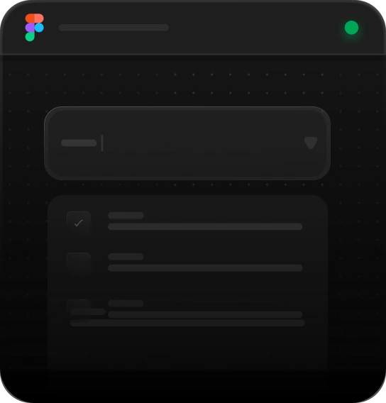
Apps
Best for
Global search, app switchers, integration pickers
Anatomy
Search field · app/integration tabs · category pills · an empty-results state


No people found
Try a different name, keyword, or filter.
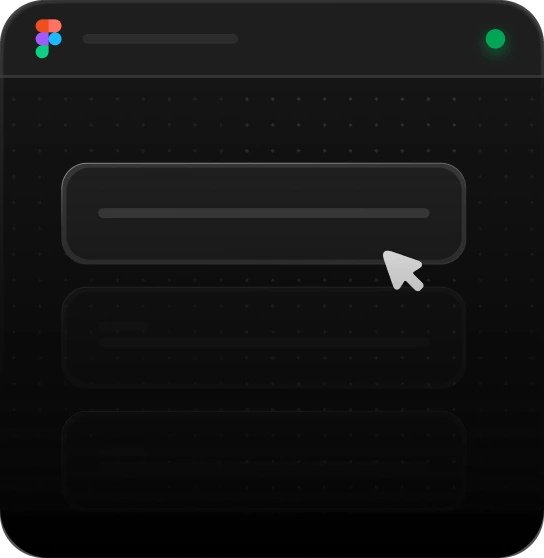
Recent activity
Best for
Dashboards, workspace switchers, jump-back-in menus
Anatomy
Search field · category pills · a Recent list · a secondary utility list
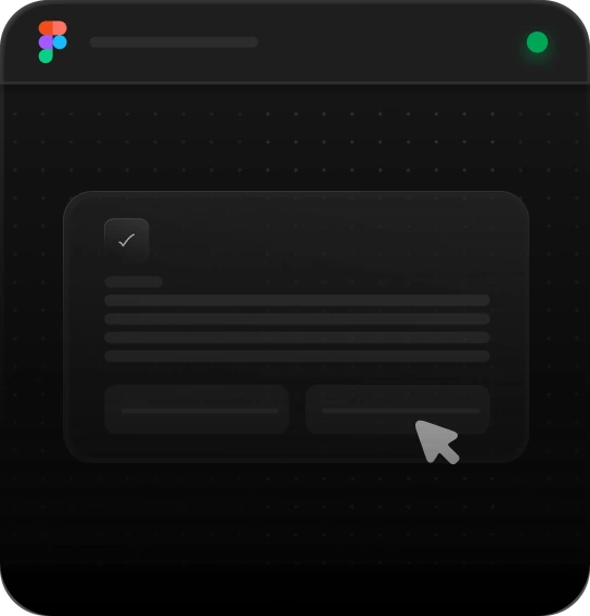
Recent
No results for “”
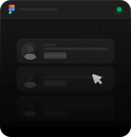
Suggested
Best for
Onboarding, empty workspaces, mixed-content search
Anatomy
Search field · Suggested/People/Actions sections · file, avatar, and icon rows with rich metadata
Suggested
People
Actions
No results for “”
Using Command Menus
Reach for it when
- The app has more destinations and actions than a sidebar can hold
- People are in the product daily and want to keep their hands on the keyboard
- One query has to span kinds: files, people, settings and actions together
- You need a jump-back-in surface showing the last things touched before anything is typed
Reach for something else when
- First-run or occasional users: a menu that must be summoned teaches nothing, so ship visible navigation and let this sit on top of it
- One list of one kind is being narrowed: a search field over that list does it without adding a layer
- Picking a value for a field: a combobox keeps the choice next to the thing it fills
Where it shows up
Workspace navigation
A tool with dozens of destinations lets people jump by name rather than by memory of the sidebar. A recents list at the top covers the common case, which is returning to whatever was open yesterday.
Cross-entity search
One query returns files, people and actions in separate labelled sections, so somebody who half-remembers a name does not have to decide first which kind of thing they are looking for.
Integration pickers
A tab row narrows the menu to apps and integrations, with category pills beneath it, so connecting a service becomes a search instead of a hunt through a settings tree nobody has read.
Running actions
Verbs that would otherwise need their own page (invite a teammate, rename a workspace, start an export) become rows that run on Enter, which is what makes the menu worth opening for people who already know the app.
Questions
What should a command menu show before anything is typed?
Its most valuable state is the open and empty one. Show recent items and a short list of common actions, so the menu is useful on the first keystroke and reads as a menu rather than a blank field. Labelled groups also teach people what the menu can reach, which is what turns a one-time user into a daily one.
Which keyboard shortcut should open a command menu?
The convention is Cmd+K on macOS and Ctrl+K on Windows and Linux, with a forward slash sometimes offered as a second opener in text-light apps. Whichever you pick, print the hint inside the search affordance it replaces so it can be learned. Escape should close the panel, arrow keys move the selection, and Enter run the highlighted row.
Premium components,
free in your inbox.
Join the Orvain Dispatch and get production-ready components, free to keep: React and Vue code plus the Figma frame, yours to ship.


 Orvain MCP
Command Menus
A command menu is a search-first overlay, usually summoned by a keyboard shortcut, that puts an application's destinations, actions and records behind one field, so people type what they want instead of learning where it lives. Results arrive in labelled groups (recent items, people, actions) and the highlighted row runs on Enter. It is an accelerator laid over navigation that already exists, not a replacement for it.
Most of the work is in ranking and naming, not in the panel. A menu sorted alphabetically is a menu nobody opens twice; recency and frequency are what make the top rows right. Name actions with the verb a person would say out loud, because that is what they will type. And treat the empty state as a real screen rather than a fallback: it is what everyone sees at the moment of opening, before a single character is entered, and again whenever a query misses.
Apps
Best for
Global search, app switchers, integration pickers
Anatomy
Search field · app/integration tabs · category pills · an empty-results state
No people found
Try a different name, keyword, or filter.
Recent activity
Best for
Dashboards, workspace switchers, jump-back-in menus
Anatomy
Search field · category pills · a Recent list · a secondary utility list
Recent
No results for “”
Suggested
Best for
Onboarding, empty workspaces, mixed-content search
Anatomy
Search field · Suggested/People/Actions sections · file, avatar, and icon rows with rich metadata
Suggested
People
Actions
No results for “”
Using Command Menus
Reach for it when
- The app has more destinations and actions than a sidebar can hold
- People are in the product daily and want to keep their hands on the keyboard
- One query has to span kinds: files, people, settings and actions together
- You need a jump-back-in surface showing the last things touched before anything is typed
Reach for something else when
- First-run or occasional users: a menu that must be summoned teaches nothing, so ship visible navigation and let this sit on top of it
- One list of one kind is being narrowed: a search field over that list does it without adding a layer
- Picking a value for a field: a combobox keeps the choice next to the thing it fills
Where it shows up
Workspace navigation
A tool with dozens of destinations lets people jump by name rather than by memory of the sidebar. A recents list at the top covers the common case, which is returning to whatever was open yesterday.
Cross-entity search
One query returns files, people and actions in separate labelled sections, so somebody who half-remembers a name does not have to decide first which kind of thing they are looking for.
Integration pickers
A tab row narrows the menu to apps and integrations, with category pills beneath it, so connecting a service becomes a search instead of a hunt through a settings tree nobody has read.
Running actions
Verbs that would otherwise need their own page (invite a teammate, rename a workspace, start an export) become rows that run on Enter, which is what makes the menu worth opening for people who already know the app.
Questions
What should a command menu show before anything is typed?
Its most valuable state is the open and empty one. Show recent items and a short list of common actions, so the menu is useful on the first keystroke and reads as a menu rather than a blank field. Labelled groups also teach people what the menu can reach, which is what turns a one-time user into a daily one.
Which keyboard shortcut should open a command menu?
The convention is Cmd+K on macOS and Ctrl+K on Windows and Linux, with a forward slash sometimes offered as a second opener in text-light apps. Whichever you pick, print the hint inside the search affordance it replaces so it can be learned. Escape should close the panel, arrow keys move the selection, and Enter run the highlighted row.
Related blocks
All blocksPremium components, free in your inbox.
Join the Orvain Dispatch and get production-ready components, free to keep: React and Vue code plus the Figma frame, yours to ship.
