
Onboarding Tours
An onboarding tour is a sequence of coachmarks, small cards anchored to real controls, with the rest of the screen dimmed behind them. That walks somebody through an interface on first run, or points out one thing to people already using it. Each card names what it is pointing at, says why that matters, and offers a way out. The spotlight is what separates a tour from a popover somebody left open: the ring and the dim say this, now, and nothing else.
Worth admitting up front: most tour steps mark a place where the interface failed to explain itself. That makes the tour a decent diagnostic, if a step cannot be removed by fixing a label, a default or an empty state, it has earned its place. The other lesson is about shape. A walkthrough needs a step counter so the end is visible from the beginning, while a single announcement needs no counter and no Back or Next at all, and handing it one implies a sequence that does not exist.
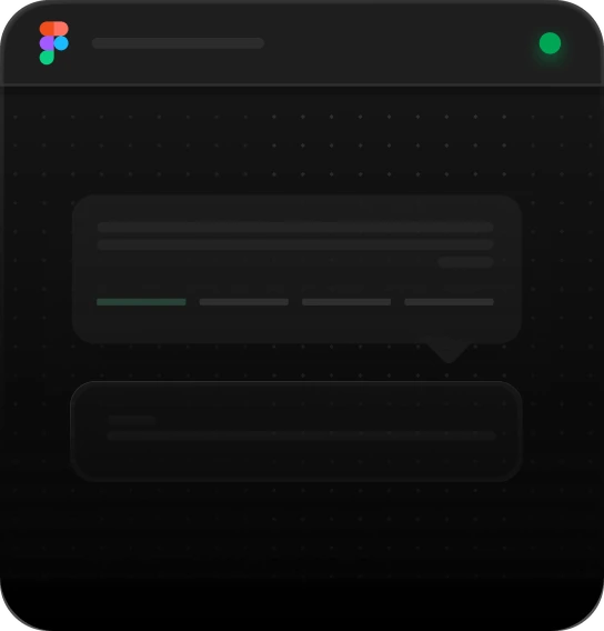
Tour Step
Best for
Multi-step product walkthroughs, first-run feature tours
Anatomy
Spotlit target · tail under the anchor · avatar · title & description · dismiss · step dots with Back/Next

Your profile lives here
Set a display name and a photo so your comments and edits are recognisable to the rest of the workspace.
Tour Step, side placement
Best for
Pointing at a nav rail, a sidebar item or anything against an edge
Anatomy
Spotlit rail icon · tail on the panel's left edge · icon badge · title & description · step dots with Back/Next
Everything you save lands here
Blocks you copy, colours you pick and fonts you upload stay in the library, shared with everyone on the team.
Tour Spotlight
Best for
Feature announcements, single-step highlights
Anatomy
Spotlit trigger · hero image · title & description · Learn More link · Got it dismiss

Start from a block
Every block on this page drops into a project as working code. Pick one, switch the device, and copy what you need.
Using Onboarding Tours
Reach for it when
- A first run where a few controls carry the whole product and nothing on screen says which
- A feature launch aimed at people who already know the app and need one thing pointed at
- A control living in a rail or a corner that nobody looks at unaided
- A workflow whose order matters and whose layout does not imply that order
Reach for something else when
- The product needs the tour to be usable: fix the labels, defaults and empty states first, since a tour only covers them over
- There is exactly one thing to say: a single anchored card with a dismiss says it, without a counter or a Back button
- The content is reference material people return to. That belongs in docs or a help panel they can open when they want it
Where it shows up
First-run walkthroughs
A new account lands on an empty workspace. The tour points at the few controls that create the first real object, in the order they get used, and stops once there is something on screen to work with.
Feature launches
An existing user opens the app and finds one card over the new thing, carrying an image, a line of explanation, a link to read more and a dismiss. There is no counter, because there is nothing to count.
Rail and corner controls
Icon rails and toolbars hold controls that never get looked at. A card anchored to the side of the rail, with its tail on the panel's edge, is how some of those finally get found.
Relocated controls
After a redesign, a coachmark on a control's new home tells returning users where it went. It is the cheapest way to absorb a change that would otherwise arrive as a run of support tickets.
Questions
How many steps should an onboarding tour have?
Fewer than you want. Every step spends attention before anyone has gained anything, so keep it to the controls a person needs in their first session and leave the rest to be discovered in use. Show which step of how many is on screen, so the end is visible from the start, and allow skipping at any point without penalty.
Should an onboarding tour be skippable?
Yes, at every step, through a dismiss that is visible rather than tucked into a corner. Record that it was dismissed and do not show it again on the next visit; a tour that comes back after being closed reads as a bug and trains people to hunt for the close control instead of reading the card. Offer a way to restart it from help.
Be first in,
and 10% off.
Join the list and we’ll email you the moment the code library and MCP server go live: with a 10% discount code to use whenever you decide to buy.


Onboarding Tours
An onboarding tour is a sequence of coachmarks, small cards anchored to real controls, with the rest of the screen dimmed behind them. That walks somebody through an interface on first run, or points out one thing to people already using it. Each card names what it is pointing at, says why that matters, and offers a way out. The spotlight is what separates a tour from a popover somebody left open: the ring and the dim say this, now, and nothing else.
Worth admitting up front: most tour steps mark a place where the interface failed to explain itself. That makes the tour a decent diagnostic, if a step cannot be removed by fixing a label, a default or an empty state, it has earned its place. The other lesson is about shape. A walkthrough needs a step counter so the end is visible from the beginning, while a single announcement needs no counter and no Back or Next at all, and handing it one implies a sequence that does not exist.
Tour Step
Best for
Multi-step product walkthroughs, first-run feature tours
Anatomy
Spotlit target · tail under the anchor · avatar · title & description · dismiss · step dots with Back/Next
Your profile lives here
Set a display name and a photo so your comments and edits are recognisable to the rest of the workspace.
Tour Step, side placement
Best for
Pointing at a nav rail, a sidebar item or anything against an edge
Anatomy
Spotlit rail icon · tail on the panel's left edge · icon badge · title & description · step dots with Back/Next
Everything you save lands here
Blocks you copy, colours you pick and fonts you upload stay in the library, shared with everyone on the team.
Tour Spotlight
Best for
Feature announcements, single-step highlights
Anatomy
Spotlit trigger · hero image · title & description · Learn More link · Got it dismiss
Start from a block
Every block on this page drops into a project as working code. Pick one, switch the device, and copy what you need.
Using Onboarding Tours
Reach for it when
- A first run where a few controls carry the whole product and nothing on screen says which
- A feature launch aimed at people who already know the app and need one thing pointed at
- A control living in a rail or a corner that nobody looks at unaided
- A workflow whose order matters and whose layout does not imply that order
Reach for something else when
- The product needs the tour to be usable: fix the labels, defaults and empty states first, since a tour only covers them over
- There is exactly one thing to say: a single anchored card with a dismiss says it, without a counter or a Back button
- The content is reference material people return to. That belongs in docs or a help panel they can open when they want it
Where it shows up
First-run walkthroughs
A new account lands on an empty workspace. The tour points at the few controls that create the first real object, in the order they get used, and stops once there is something on screen to work with.
Feature launches
An existing user opens the app and finds one card over the new thing, carrying an image, a line of explanation, a link to read more and a dismiss. There is no counter, because there is nothing to count.
Rail and corner controls
Icon rails and toolbars hold controls that never get looked at. A card anchored to the side of the rail, with its tail on the panel's edge, is how some of those finally get found.
Relocated controls
After a redesign, a coachmark on a control's new home tells returning users where it went. It is the cheapest way to absorb a change that would otherwise arrive as a run of support tickets.
Questions
How many steps should an onboarding tour have?
Fewer than you want. Every step spends attention before anyone has gained anything, so keep it to the controls a person needs in their first session and leave the rest to be discovered in use. Show which step of how many is on screen, so the end is visible from the start, and allow skipping at any point without penalty.
Should an onboarding tour be skippable?
Yes, at every step, through a dismiss that is visible rather than tucked into a corner. Record that it was dismissed and do not show it again on the next visit; a tour that comes back after being closed reads as a bug and trains people to hunt for the close control instead of reading the card. Offer a way to restart it from help.
Related blocks
All blocksBe first in, and 10% off.
Join the list and we’ll email you the moment the code library and MCP server go live: with a 10% discount code to use whenever you decide to buy.