
Popovers
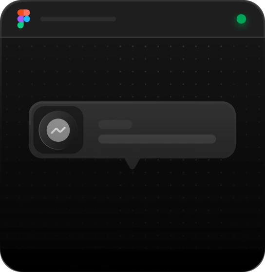
A popover is a small panel anchored to a trigger, usually with a tail pointing back at it, holding content that is too large for a tooltip and too minor to justify a modal. It floats over the page without blocking it, and it closes on Escape, on a click outside, or through its own dismiss. What separates it from a tooltip is not size but interactivity: a popover can hold links, fields and buttons, so it has to be reachable and dismissible from the keyboard.
Placement is where the engineering goes. A panel anchored below a trigger near the foot of the viewport has to flip above it; one aligned to an edge has to shift inward when the room runs out; and the tail has to keep pointing at the trigger through both, or the panel stops reading as belonging to anything. The content varies more than people expect: the same primitive carries a share sheet, a chart readout, a rule list that fills in as a password is typed, and one step of a walkthrough.
Context Popover
Best for
Coachmarks, feature spotlights, guided tours
Anatomy
Placement selector · description text · dismiss · a working N of 4 step counter with Back/Next
Pinned items now sit at the top of every list. Drag a row here to pin it.
1 of 4
Links Popover
Best for
Share sheets, invite flows, link distribution
Anatomy
Placement selector · channel rows with copy-link feedback · a visibility dropdown · Copy Link


Gmail


Telegram
Data Popover
Best for
Chart tooltips, dashboard drill-downs
Anatomy
Placement selector · title and date · dot-coded legend rows · Close/Analytics footer
Impressions
Tuesday 17 February 2026
Desktop
1
Mobile
49
Tablet
5
Step 1 of 4
Metric Popover
Best for
Dashboard KPI drill-downs, report call-outs
Anatomy
Placement selector · accent bar and headline stat · a two-cell key/value row · Close/Analytics footer
35.92%
397.66 of 1,107
GB
Country
Q1/2026
Quarters
Step 1 of 4
Password Popover
Best for
Sign-up forms, password reset, security settings
Anatomy
Placement selector · a focus-triggered strength meter · live-validated criteria rows · dismiss
Must contain at least:
At least 1 uppercase
At least 1 number
At least 8 characters
At least 1 symbol
Using Popovers
Reach for it when
- A chart point needs a readout carrying links or actions a tooltip cannot hold
- A share action needs channels and a link field without sending the page to a modal
- A password field needs its rules visible beside it while someone is typing
- A single piece of guidance has to point at the control it is describing
Reach for something else when
- The content is a plain label shown on hover: a tooltip needs no focus, no dismissal and no tab stop
- The task has to be finished or abandoned before anything else happens: a modal traps focus and makes that demand explicit
- It is a list of actions on an object: a menu already has the arrow-key and typeahead behaviour you would otherwise rebuild
Where it shows up
Chart drill-downs
A point on a series opens a readout: the date, a legend of contributing values with their colour dots, and a link through to the full report. A tooltip could not have carried that link.
Share sheets
A share button opens channels with a copy control on each row and a visibility setting under them, and the page stays where it was. Sharing is a side errand, not a task worth taking over the screen.
Password rules
Focusing a password field opens the criteria beside it and marks each one as the typing satisfies it, so the requirements are visible while they are being met instead of after a rejected submit.
Metric call-outs
A dashboard tile opens its own headline figure with a key and value pair beneath it and a way into the analytics behind it, which gives a dashboard a second level of detail without a second page.
Questions
What is the difference between a tooltip and a popover?
A tooltip is a short label shown on hover or focus that contains nothing you can click; it describes its trigger and disappears when you move away. A popover holds interactive content, so it must be dismissible on its own terms (Escape, an outside click, or a close control) and everything inside it has to be reachable by keyboard.
Where should a popover be positioned relative to its trigger?
Choose a preferred side and alignment from the layout, such as below a field or beside an item in a rail, then let the panel flip to the opposite side when there is not enough room and shift along the edge so it stays on screen. The tail must still point at the trigger after any flip, or the panel stops reading as anchored to it.
Be first in,
and 10% off.
Join the list and we’ll email you the moment the code library and MCP server go live: with a 10% discount code to use whenever you decide to buy.


Popovers
A popover is a small panel anchored to a trigger, usually with a tail pointing back at it, holding content that is too large for a tooltip and too minor to justify a modal. It floats over the page without blocking it, and it closes on Escape, on a click outside, or through its own dismiss. What separates it from a tooltip is not size but interactivity: a popover can hold links, fields and buttons, so it has to be reachable and dismissible from the keyboard.
Placement is where the engineering goes. A panel anchored below a trigger near the foot of the viewport has to flip above it; one aligned to an edge has to shift inward when the room runs out; and the tail has to keep pointing at the trigger through both, or the panel stops reading as belonging to anything. The content varies more than people expect: the same primitive carries a share sheet, a chart readout, a rule list that fills in as a password is typed, and one step of a walkthrough.
Context Popover
Best for
Coachmarks, feature spotlights, guided tours
Anatomy
Placement selector · description text · dismiss · a working N of 4 step counter with Back/Next
Pinned items now sit at the top of every list. Drag a row here to pin it.
1 of 4
Links Popover
Best for
Share sheets, invite flows, link distribution
Anatomy
Placement selector · channel rows with copy-link feedback · a visibility dropdown · Copy Link
Gmail
Telegram
Data Popover
Best for
Chart tooltips, dashboard drill-downs
Anatomy
Placement selector · title and date · dot-coded legend rows · Close/Analytics footer
Impressions
Tuesday 17 February 2026
Desktop
1
Mobile
49
Tablet
5
Step 1 of 4
Metric Popover
Best for
Dashboard KPI drill-downs, report call-outs
Anatomy
Placement selector · accent bar and headline stat · a two-cell key/value row · Close/Analytics footer
35.92%
397.66 of 1,107
GB
Country
Q1/2026
Quarters
Step 1 of 4
Password Popover
Best for
Sign-up forms, password reset, security settings
Anatomy
Placement selector · a focus-triggered strength meter · live-validated criteria rows · dismiss
Must contain at least:
At least 1 uppercase
At least 1 number
At least 8 characters
At least 1 symbol
Using Popovers
Reach for it when
- A chart point needs a readout carrying links or actions a tooltip cannot hold
- A share action needs channels and a link field without sending the page to a modal
- A password field needs its rules visible beside it while someone is typing
- A single piece of guidance has to point at the control it is describing
Reach for something else when
- The content is a plain label shown on hover: a tooltip needs no focus, no dismissal and no tab stop
- The task has to be finished or abandoned before anything else happens: a modal traps focus and makes that demand explicit
- It is a list of actions on an object: a menu already has the arrow-key and typeahead behaviour you would otherwise rebuild
Where it shows up
Chart drill-downs
A point on a series opens a readout: the date, a legend of contributing values with their colour dots, and a link through to the full report. A tooltip could not have carried that link.
Share sheets
A share button opens channels with a copy control on each row and a visibility setting under them, and the page stays where it was. Sharing is a side errand, not a task worth taking over the screen.
Password rules
Focusing a password field opens the criteria beside it and marks each one as the typing satisfies it, so the requirements are visible while they are being met instead of after a rejected submit.
Metric call-outs
A dashboard tile opens its own headline figure with a key and value pair beneath it and a way into the analytics behind it, which gives a dashboard a second level of detail without a second page.
Questions
What is the difference between a tooltip and a popover?
A tooltip is a short label shown on hover or focus that contains nothing you can click; it describes its trigger and disappears when you move away. A popover holds interactive content, so it must be dismissible on its own terms (Escape, an outside click, or a close control) and everything inside it has to be reachable by keyboard.
Where should a popover be positioned relative to its trigger?
Choose a preferred side and alignment from the layout, such as below a field or beside an item in a rail, then let the panel flip to the opposite side when there is not enough room and shift along the edge so it stays on screen. The tail must still point at the trigger after any flip, or the panel stops reading as anchored to it.
Related blocks
All blocksBe first in, and 10% off.
Join the list and we’ll email you the moment the code library and MCP server go live: with a 10% discount code to use whenever you decide to buy.